Destination Nashville Hotel at 4th and Ash Design Competition
Location:
4th and Ash Street
Nashville, Tennessee
Status:
Competition Spring 2019
Size:
78,700 SF
Client:
Green Island Investments Mark Cleveland
Shop Team:
James Kennon
Katherine Kennon
Daniel Alderman
Beasley Chantharath
Spencer McCarthy
Michael Kretz
Cary Sweat
Project Collaborators:
General Contractor:
DF Chase
Structural Engineer:
EMC Structural Engineers
Civil Engineering:
Civil Site Design Group
The challenge of the competition was to develop 12-16 floor boutique hotel on a small 5,000 s.f. triangular site at the edge of the current downtown Nashville growth explosion. Programmatically, the microhotel concept called for a floor plate that would accommodate a total capacity of 200 or more rooms. As part of the unique spirit of the hotel, amenities were to include ‘grab-n-go’ breakfast area, a ‘speak-easy’ bar and a rooftop bar. Architecturally, the challenge was to create a building that was both iconic; yet explicitly Nashville.
Our submission resisted being limited by any single identity that has been given to Nashville over the centuries, including the ‘Athens of the South’, ‘Music City’ or the more recent ‘It City’. Instead, our response chose to emphasize the enduring characteristics that both make Nashville unique and for centuries have made it a ‘destination’ city.
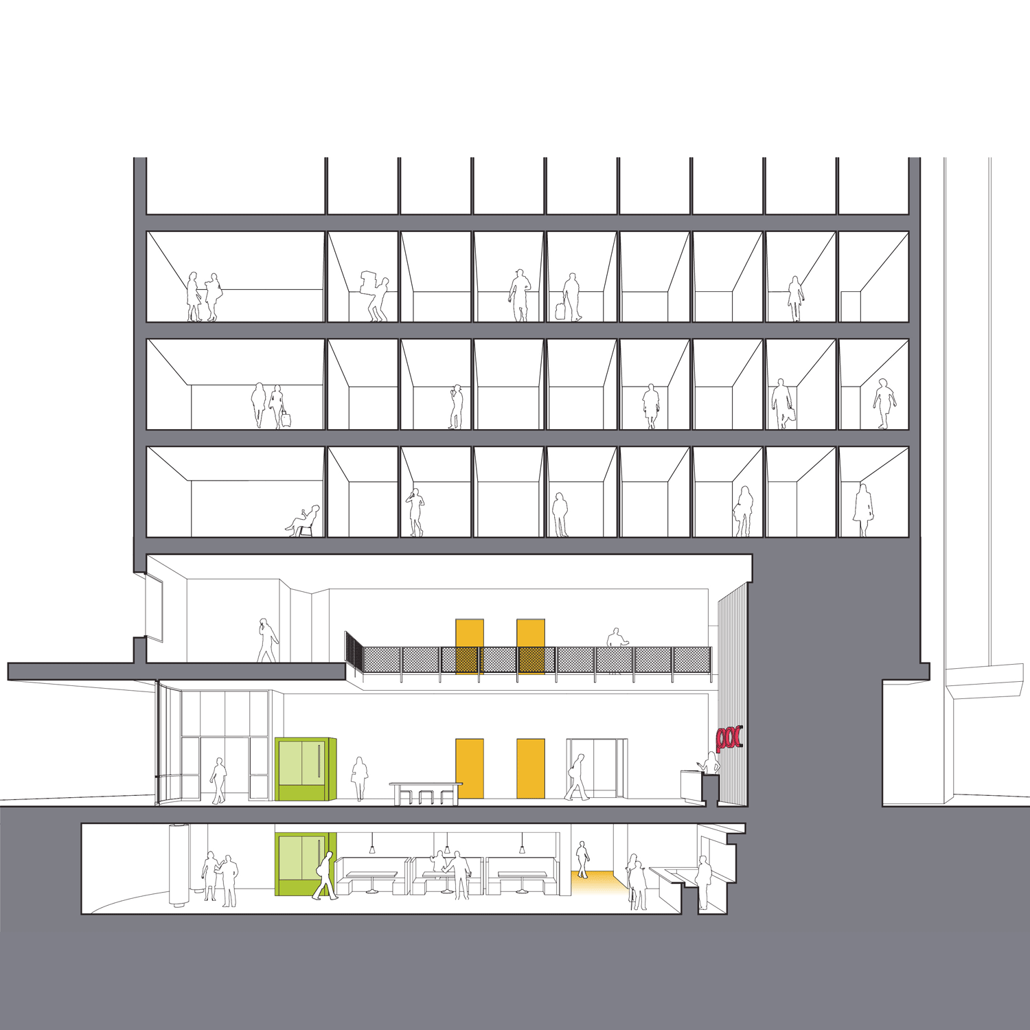
The pragmatics: The site and floor plan elements respond to the dynamics of the triangular site and the traffic patterns around and to the site. The first floor and mezzanine serve the public lobby functions including the secret entry to the speakeasy hidden below the street level. The overall solution provided 20 rooms per floor on 13 floors (273 total). The organization of the hotel rooms in separate bar forms allowed for views out to the city at the juncture of the bars in each direction. Gathering areas adjacent to the elevators were integrated on each floor to balance the reduced room size of less than 120 s.f.
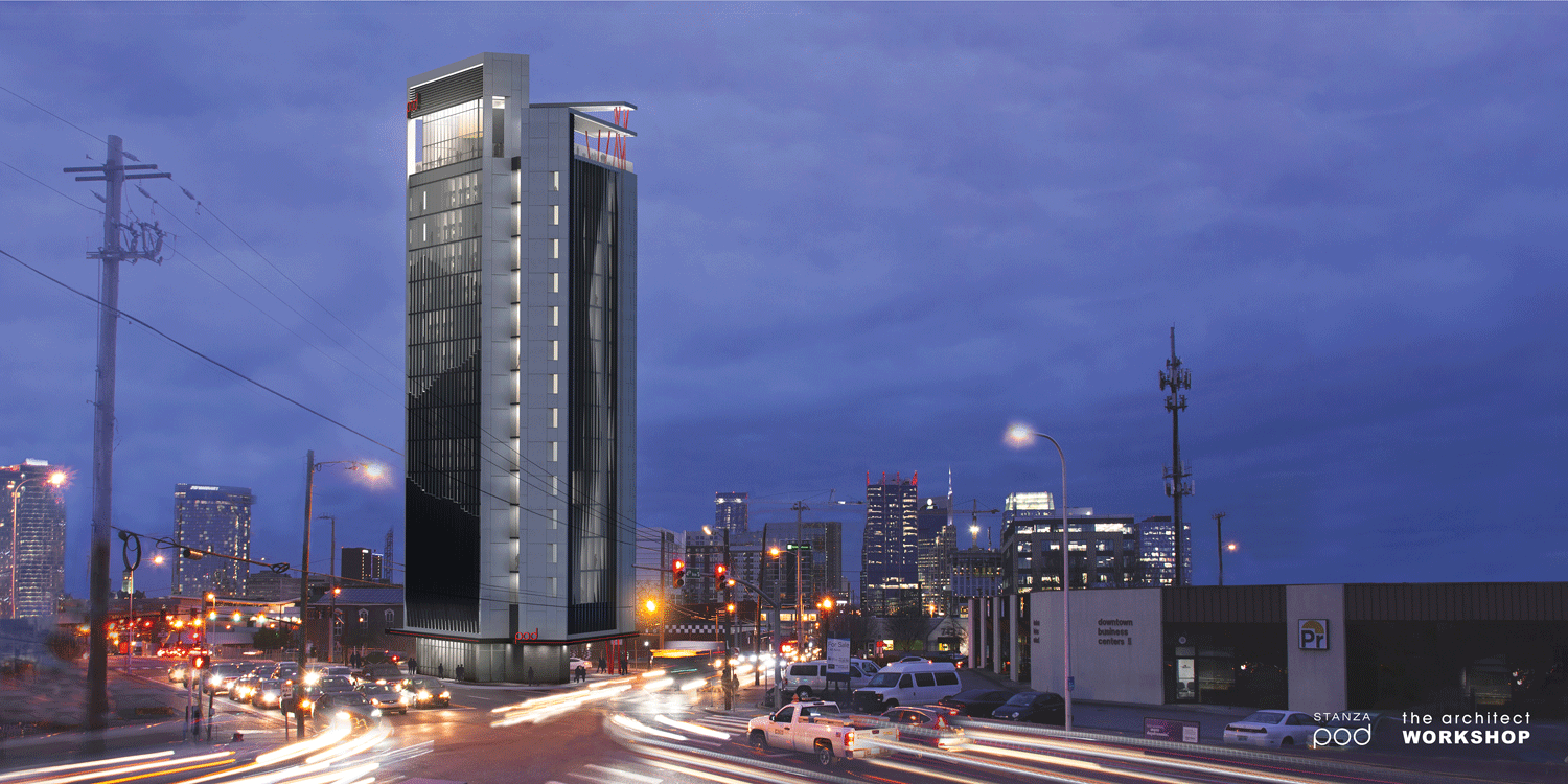
The imagery: Our proposal of the hotel ‘Destination Nashville’ focuses on Nashville as a destination for people and the many unique and changing reasons people come to Nashville – from the Native Americans who followed the deer to the natural salt lick as a hunting ground to the music festivals, tourists and the new to town. Our response was comprehensive to the whole experience: we suggested integrated check-in technology (using the numerical coordinates for Nashville – allowing not only check in/out features, but also information sharing among guests including the reason that brought them to Nashville, enhancing the communal experience among the temporary Nashville natives), proposed menu items such as ‘Salt Lick Margaritas’ for the rooftop bar, and the use of local art throughout the facility – to celebrate Nashville in every aspect. Architecturally, three prominent bar forms responded to the city dynamics, the small room bands and the triangular site. Each of the three facades created by the bar forms are then articulated to reflect the unique aspect of Nashville that it faces: the Cumberland River, the hills and the city grid. The images on the facades are created by varying the depth of the vertical fins on the elevation face and are enhanced with the use of frit and colored glass. Subtle homage is given in material and form to the historic L&C Tower (the first modern Nashville high-rise) and other the native materials of limestone and metals used within the existing fabric of the current and historical city.


